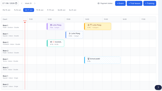
How Colours Are Used
Each booking type is assigned a specific colour, allowing users to recognise reservations at a glance. These colours remain consistent throughout the dashboard, ensuring a familiar and intuitive experience.
Payment Statuses
Payment statuses are displayed separately from booking colours. This distinction helps keep the dashboard easy to read while allowing both booking information and payment information to be visible at the same time.
By separating these two types of information:
- Booking colours remain dedicated to identifying booking types.
- Payment statuses can be viewed independently without affecting the booking overview.
- Important payment-related information is easier to scan and understand.
Why This Approach Is Used
As additional booking types are introduced, relying on colours to represent multiple types of information can make the dashboard more difficult to interpret. Separating booking colours from payment statuses helps maintain a clear and scalable dashboard structure while supporting future platform growth.
Example
In the Occupancy Dashboard, bookings are displayed using their assigned booking colours, while payment statuses are shown separately. This allows staff to quickly identify both the type of reservation and its payment status without confusion.